The Opportunity
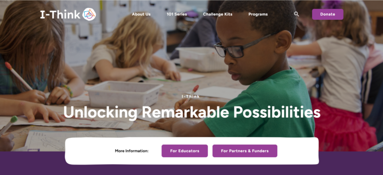
Our client is an incredible non-profit focused on equipping young learners with the skills and confidence to drive change, and developing their 21st century skills and competencies. They develop critical thinking and problem-solving initiatives for use in Kindergarten through Grade 12 classrooms.

The client’s website is key to executing their mission, but it wasn’t delivering the clarity of content or friendly user experience that their audiences (educators and partners) needed. It includes:
- E-commerce components
- General information
- Access to programming
Pinnguaq was retained to reboot their current site with less – but more meaningful – content, targeting the two specific audiences while helping the client achieve its very impressive (and important) goals. Specific objectives included:
- A content management system that non-technical staff could easily use
- Standard page formats for specific content types
- Cost reductions
- Usability and user experience improvements
The Approach
Pinnguaq takes a collaborative approach founded in the concept of co-design. We work to understand not just the client objectives, but the desired experience of website managers and website users, to ensure that the end project checks all the boxes, but also offers a logical, appealing interface. In this instance, our process included:
- Initial discovery sessions: These sessions involved in-depth conversations with client staff – not just leadership and technical teams, but also the people involved in the day-to-day management of the website, and educators. The goal was to collect holistic information, desires, objectives, obstacles and requirements to inform site design and structure.
- Co-design sessions to define the sitemap, UI and user journeys: We combined our team’s expertise in website development and design with real-world feedback from the client and users. This gave us invaluable insight directly from educators (end users) and site managers (client), and helped us structure the site in a way that made sense to the people who would use it.
Next, we created a sitemap user experience exercise and workshop with our client and once the sitemap was approved, we designed the wireframes. We held co-design sessions for user journey and sitemap activities, and implemented customized ready-made patterns making it easy for the client to simply insert content. In this case, we used a block-based layout to allow the client to flexibly structure their pages and add content, while adhering to their brand style guide.

The Results
Not only is the new website user-friendly and functional, we were also able to reduce the costs for website maintenance, proving once again that our approach to software implementation for other nonprofits is a model for success.
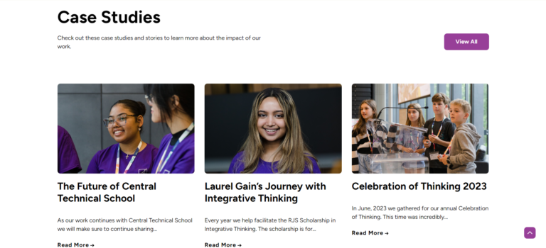
The client’s website is now equipped with custom post types such as Challenge Kits, Programs, Courses and Case Studies, all important in the organization’s work to offer the skills and confidence to succeed. We moved the site from SquareSpace to WordPress and incorporated the tools necessary for them to manage their contacts and send newsletters.

The client provided positive feedback about the website and enjoyed the collaboration, content creation and build process. We’ve trained them about how to use their website, which is now live (and looking great). We’re confident the redesign will increase user participation and interaction on the website while addressing the various audiences and making it easier for our client to manage their online presence.
